Bentley
2002-PresentCurrent Bentley Logo
Bentley Logo Meaning
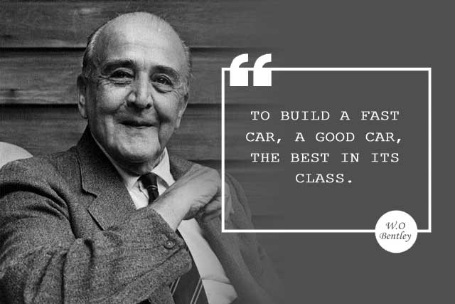
Since Bentley's inception in 1919, founder Walter Owen Bentley has already cemented his vision for the brand: a fast car and the best of its kind.
 "To build a fast car, a good car, the best in its class.”
— The Founder's Vision
The bolded letter B' is a means of homage to the auto company's founder, the pair of flying wings in the logo represents both speed and power as their vehicles come with enough horsepower and beautiful luxury. The second meaning of the flying wings reflects the founder's relentless passion for motion.
The reason why flying wings are used in the company's logo is due to W.O. Bentley's past in WWI when he decided to pass his secret advantage and helped by designing engines for fighter aircraft, and thanks to his efforts and contributions during the war, he was awarded an MBE (Most Excellent Order of the British Empire) and 8000 pounds that were enough to start its dream of creating a car company. Taking this into consideration, F. Gordon Crosby decided to introduce wings as a reference to W.O. Bentley's characteristic aircraft history.
Brand Overview
Founded: 1919
Founder: W. O. Bentley
Headquarters: Crewe, England
Parent: Volkswagen Group
Official Site: www.bentleymotors.com
Bentley Motors Limited is a British company that designs, develops, and manufactures luxury motorcars that are largely hand-built. It is a subsidiary of Volkswagen AG. Now based in Crewe, England, Bentley Motors Limited was founded by W. O. Bentley on 18 January 1919 in Cricklewood, North London.
Prominent models extend from the historic sports-racing Bentley 4½ Litre and Bentley Speed Six; the more recent Bentley R Type Continental, Bentley Turbo R, and Bentley Arnage; to its current model line, including the Flying Spur, Continental GT, Bentayga, and the Mulsanne—which are marketed worldwide, with China as its largest market as of July 2021.
Learn More: Bentley Wiki
Other Logo
2002-PresentBentley Logo
In the 1930s, when Bentley was under Rolls Royce ownership, the Bentley wings were streamlined, with the downward-pointing feathers straightened out to become horizontal. Each wing was also given 10 feathers, losing the asymmetry of the original.
The Bentley logo was revised again in the 1990s and, as a nod to Crosby, the asymmetry was restored and the central ‘B’ revised to echo the original. Then in 2002, a definitive new corporate identity was created, including the winged ‘B’ that is still in use today, one that embodies modern Bentley values while still respecting its origins.


